
About Our Logo
When I was trying to come up with a logo for AquaTerra Coaching, I knew I wanted something relatively simple, yet striking. Of course it had to be representative of triathlon, but I didn’t want the same old swimmer/cyclist/runner trifecta. I wanted it to represent something more significant. It needed to speak to my ethos; it needed to embody my desire to introduce people to a whole new, exciting and healthy lifestyle that has the power to promote balance and harmony in all facets of their life. And it’d be cool if it could also sneak in a bit of my Irish heritage.
I had a basis from which to start. My son has a fish & reptile tank cleaning business he named “AquaTerra Habitats” (Aqua is Latin for water, and Terra is Latin for “earth, land or ground”). I designed his logo. My wife actually came up with the “AquaTerra” term, and I thought it worked well for my purposes too, so with my son’s permission, I used it and the lettering, also borrowing the “blue wave” from his logo. But try as I may, I just couldn’t seem to get a three-animal logo to gel. I started looking at “tribal” designs, trying to simplify things.
As I was looking at all sorts of tribal animal designs, the search engine kept throwing in all manner of other tribal designs (mostly tattoos (do yourself a favor and do NOT look at tattoos on the Internet!)), and that dredged up all variety of Celtic designs as well. That’s when I came upon the ancient “Celtic Triquetra of Harmony.”
The Triquetra of Harmony I learned is a symbol of the adaptation of individual parts combined in a system, intended to form a connected whole to produce unity and trinity of the heart, mind and soul. Three distinct yet interlocked levels: physical, mental and spiritual. Hmmm, I said to myself. Sounds a lot like triathlon!

I started toying with the triquetra design, hoping to be able to make it somewhat unique and suitable as a symbol for AquaTerra Coaching’s mission. That’s when changing the circle that rings through the three leaves into a heart came to mind. But in order to keep the unbroken path, there had to be two “bottoms” of the heart. So without even realizing it, I had drawn an apple-shaped heart. Or a heart-shaped apple. Apple. Heart. I ❤ NY! The Big Apple! Of course! I’m based in Northport, NY! The design immediately spoke to me.

Doing some further research, I learned that when a Celtic design incorporates a heart shape, it is known as the Love Knot. The complex pattern of intertwining loops that have no beginning nor end is symbolic of an eternal love. The love represented is not just that which exists between two people (but of course that is a major theme, and I do love my wife and family), but more importantly for me and my coaching philosophy, it is representative of a universal love. It’s that driving force behind our human existence, emblematic of the relationships that we share with friends and family, our community, animals, nature, and ourselves. It speaks to a faith both in ourselves and in others, as well as our personal connection to the divine. A heart that is open - to give as well as receive - generosity and trust cannot be defeated. The unending ribbon is symbolic of life-affirming love in our lives as both the pathway to personal happiness and fulfillment, as well as to the adventures of the unknown. Faith, Open-heartedness, and Adventure; the true triad that forms the sport of triathlon.
Apples, not surprisingly, were considered the fruit of the gods in Celtic lore. The Celts attributed the power of healing and youth, or rebirth, to apples. They represent illumination, the gaining of knowledge and a choice of beauty, the beauty of life and youthfulness in mind, body and soul.
Universal love and life-affirming renewal. The elegant symbolism of my modified triquetra was almost complete. But still, I felt there was something lacking. On a whim, I placed the triquetra inside of a circle, and made the triquetra orange, sitting on a white background and the circle green. Irish colors!
I tried putting the lettering with the “blue wave” to the side of the logo (as it is with AquaTerra Habitats), which was fine, but it didn’t carry the impact that it did with my son’s logo. So I placed it below the circle. Immediately, the image of a full moon rising over the sea came to mind. Symbolically, one of the great powers the tides have is that they are restless. They are a ceaseless, endless cycle. The power of the tides is well known to sailors and Open Water Swimmers alike.
It turns out that water is perhaps the most important element in Celtic mysticism. From it, life emerges. Through it, legend has it, we pass from weakness to strength, from sickness to health and then from this world into the Otherworld. Water serves as an instrument that reveals and judges (often harshly, as any swimmer will attest!).
Universally, water is symbolic of purity, fertility, life, motion, renewal, and transformation. The profound symbolism of water comes from its two vital qualities – it is essential for our very existence, and it cleanses things by washing away the dross. Its power of transition from liquid to solid and/or vapor also makes it a symbol of metamorphosis, a purifying, rejuvenating element that is a guiding force in life.
The moon, according to Celtic legend, is connected to our wisdom and intuition. The Moon symbolizes emotions, feelings, instincts and day to day habit patterns, or routine. And if there’s one thing I’ve learned about life through triathlon training, it’s the power that a healthy, balanced and well-structured routine can have on one’s physical, mental and emotional well-being. And that power is harmony.
As the logo design revealed itself to me, I was also struck by how - totally unintended - it somewhat echoed a Sanskrit lotus flower or seated yogi design often seen in yoga practices. I liked that, because I really like yoga (even though I’m really bad at it). Again, the message of harmony, balance and love was being reinforced, ever so gently. And that’s why I added in the tagline, “Harmony Through Balance.” Because being well-balanced, whether it be in the water, on the bike, as you’re running, or in life itself, truly is the key to living and performing to your best possible ability.
This combination gave the overall design the kind of earthiness that I though it should have, anchoring the name of my coaching business symbolically at the edge of the sea, with the moon harmoniously shining down upon it. As I go forth and attempt to enrich people’s lives with the amazing adventure that is the multi-sport lifestyle, I will always strive to enable harmony, balance and love in all aspects of my coaching.
I hope you enjoyed this explanation of the origins of my logo design. I felt its significance and my intentions in creating it were important to share.
The AquaTerra Coaching, LLC logo is officially trademarked!
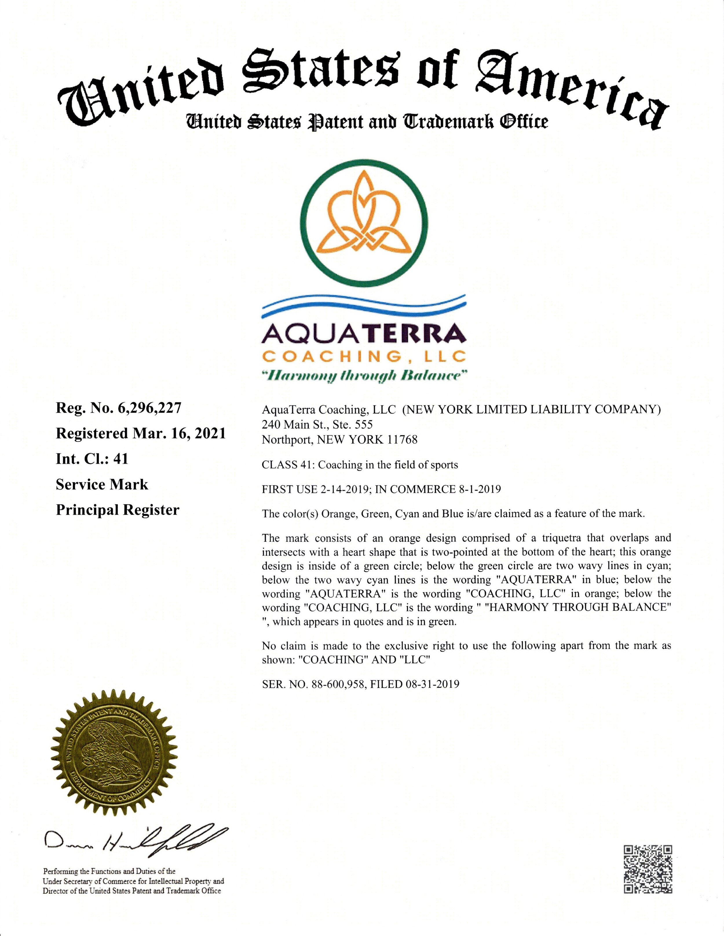
On July 14, 2020, the AquaTerra Coaching, LLC logo was officially trademarked and published on the U.S. Patent and Trademark Office (USPTO) website. On March 16, 2021, the USPTO awarded full registration (Reg. No. 6,296,227).